


















































Gottlieb Daimler drew a three-pointed star on a postcard for his wife, writing that it would one day shine over every engine and factory he built. After his death, his sons turned this symbol into a logo. The three points represent the company’s ambition to succeed on land, sea, and air. A four-pointed version was also patented, but the three-pointed one was chosen for its stronger visual impact. Since then, the core of the logo has remained unchanged.
Internet Services
This category features logos of well-known brands, companies, messengers, and popular online services. All images are available for download in vector SVG and raster PNG formats with a transparent background, making them easy to use in design, presentations, and other projects. This collection is ideal for designers, marketers, and anyone working with digital and promotional materials.

Mercedes-Benz: a drawing from a postcard

When the perfect domain is taken, eBay is born
The company was originally called Echo Bay Technology Group — named after a picturesque bay near founder Pierre Omidyar’s home. But the domain echobay.com was already taken (by a gold mining company), so Omidyar simply shortened it to ebay.com. That’s how a name that would become a global brand was born — completely by chance, but forever part of e-commerce history.
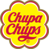
How Salvador Dalí created the Chupa Chups logo
In 1969, the Spanish artist Salvador Dalí, at the request of Chupa Chups founder Enric Bernat, sketched the idea for the future logo on a newspaper page in less than an hour during a lunch meeting. That was when the famous yellow flower shape with the brand name in the center first appeared. The image proved so successful that it became the basis of the Chupa Chups logo and has remained part of the brand for more than half a century.

Coca-Cola is the most recognizable logo in the world
The Coca-Cola logo is often called the most recognizable in the world. Research by Nielsen, Interbrand and YouGov shows that people across the globe instantly recognize the signature Spencerian lettering. This visual style has been used since the late 19th century, and over the decades it has become part of global culture: the brand is present in more than 200 countries, and its logo is considered one of the key icons of world marketing.

How did the McDonald’s logo come about?
The legendary “Golden Arches” of McDonald’s were not originally a logo, but part of the restaurant design in the 1950s — the curved structures on either side of the buildings caught the attention of passersby. In 1962, designer Jim Schindler saw potential in them and joined the arches into the shape of an “M”. This iconic emblem was born and is now recognized by millions worldwide as a symbol of fast and affordable food.